Bevel Documentation
The fast, flexible WordPress theme for Elementor. Premium widgets, a built-in performance suite, and ready-made starter sites, all in one carefully documented package.

Getting Started
Install Bevel, connect your account, and launch your first site in minutes with our step-by-step guide.
Starter Sites
Import a complete, professionally designed website in a couple of clicks, then make it your own.
Next-Gen Theme Options
Global colors, fonts, typography, layout, and every Bevel theme option, configured in one place.

One-click Optimization
Apply Bevel's recommended performance settings, caching, WebP, and more, in a single guided run.
The Bevel ecosystem
Bevel is three pieces working together: the theme, the Bevel Core plugin, and your Bevel account. Knowing what each part does makes everything else easier to follow.
The Bevel theme
The theme is the foundation installed in WordPress under Appearance, Themes. It is deliberately light. It defines the base styles, loads the Inter font, and provides the admin experience: the Bevel top bar, the Dashboard, the License page, the Updates page, the Setup Wizard, and Starter Sites. On its own the theme is minimal, because the real building blocks live in the companion plugin.
Bevel Core (the companion plugin)
Bevel Core is where the features live. It adds the premium Elementor widgets, the global site settings, the performance tools, WooCommerce integration, the mega menu, custom icon libraries, and much more. The theme expects Bevel Core to be active. If it is missing, the front end shows a friendly setup screen instead of an unstyled page. You install Bevel Core during the Setup Wizard.
Bevel Core includes all of Elementor Pro's functionality built in, so every Pro widget and feature is available with no separate Elementor Pro plugin, purchase, or license. You only need the free Elementor plugin and Bevel Core.
Your Bevel account
Your account at the Bevel website is where your license lives. Connecting your site to your account unlocks updates, premium widgets, starter sites, and support. Unlike many themes, there are no license keys to copy and paste. You click a button, authorize the site from your account, and it is connected. From the account portal you manage licenses, see which websites are activated, view orders and invoices, and open support tickets.
How the three connect
| Piece | Where it lives | What it gives you |
|---|---|---|
| Bevel theme | Your WordPress site | Base styles, admin screens, Theme Builder support |
| Bevel Core | Your WordPress site | Widgets, settings, performance tools, integrations |
| Bevel account | my.wpbevel.com | License, updates, starter sites, support |
How Bevel works
A quick mental model of the moving parts, so the rest of the guide clicks into place.
Rendering
Your pages are designed in Elementor and rendered through the Bevel theme. Headers, footers, single-post layouts, and archive layouts are built with Elementor's Theme Builder, which Bevel Core enables. This means the look of your entire site is under your visual control, not locked into fixed theme templates.
Widgets
Bevel Core registers its widgets with Elementor. They appear in the editor's widget panel under the Pro category. You drag them onto the canvas like any other widget and style them with the standard Elementor controls plus Bevel's own options. See Using Bevel widgets for the full list.
Licensing and rendering are separate
This is an important design choice. Your front end never depends on license state. If a license lapses, your live pages keep working exactly as they are, every widget still renders, and nothing is withheld from visitors. A license affects three things only: whether you can add new premium widgets from the editor panel, whether you receive updates, and whether you can import Pro starter sites and premium tools. Content you already built is always safe.
Free plan note: Sites on the free plan display a small "Built with Bevel" footer badge. Paid plans remove it. This obligation is fixed when the license is issued, so changing plans later does not change an existing site's badge.
Performance
Speed is handled by Bevel Core's optimization suite: an HTML disk cache, WebP image conversion, a JavaScript delay engine, database cleanup, and smart image preloading for the largest hero image. You can enable everything sensible in one step with One-Click Optimization, or tune each tool individually. See Performance.
Requirements
Bevel runs on standard, modern WordPress hosting. Here is what to have in place before you begin.
Software
| Component | Recommended |
|---|---|
| WordPress | 6.0 or newer |
| PHP | 7.4 or newer (8.1+ recommended) |
| Elementor (free) | Latest version |
| Bevel Core | Installed during setup (includes all Elementor Pro functionality) |
| MySQL / MariaDB | A recent, supported version |
Server settings
For smooth imports of starter sites and media, these PHP values help. Your host can adjust them if needed.
- Memory limit: 256M or higher
- Max execution time: 120 seconds or higher
- Upload and post size: large enough for a site kit ZIP (up to 50 MB)
Not sure about your server values? Install Bevel anyway. The Setup Wizard and importers are resilient, and Bevel's tools show clear messages if something needs raising.
Installing the theme
Install Bevel like any WordPress theme, then activate it. The Setup Wizard opens automatically to guide the rest.
From your Bevel account
- Sign in to your account at the Bevel website and open Licenses or the account Dashboard.
- Download the Bevel theme ZIP.
- In WordPress, go to Appearance, Themes, Add New, Upload Theme.
- Choose the ZIP, click Install Now, then Activate.
What happens on activation
When you activate Bevel for the first time, the full-screen Setup Wizard opens automatically. It installs the required plugins, connects your account, and gets you to a ready state. If you ever close it early, a reminder banner appears on your admin screens, and you can reopen the wizard at any time from the Bevel menu.
Before the required plugins are installed, your front end shows a branded "setup needed" screen to logged-in admins. Visitors are not affected. Finishing the wizard clears it.
Installing Bevel Core
Bevel Core is the companion plugin that powers the widgets, settings, and tools. The Setup Wizard installs it for you, but here is what it is and how to install it manually if you prefer.
The easy way: the wizard
On the Plugins step of the Setup Wizard, Bevel installs and activates two required plugins for you with a click:
- Elementor (the free website builder)
- Bevel Core (Bevel's features, with all Elementor Pro functionality built in)
Each row shows a status of Active, Inactive, or Not installed, with an Install or Activate button. This is the recommended path.
Installing manually
If you would rather install by hand, download the Bevel Core ZIP from your account and add it under Plugins, Add New, Upload Plugin, then activate it. Make sure the free Elementor plugin is installed and active first.
Because all Elementor Pro functionality is built into Bevel Core, you do not install or activate Elementor Pro on its own. If you already run your own Elementor Pro, Bevel Core works alongside it.
The Setup Wizard
A guided, full-screen flow that takes a fresh install to a finished, connected state in two to three minutes. It opens automatically after you activate the theme, and you can return to it anytime from the Bevel menu.
The four steps
1. Welcome
An introduction with a short preview of what setup does: install the required plugins, connect your license, and finish. A "What you'll get" panel highlights a fast start, automatic updates, and premium features. Click Start Setup to begin.
2. Plugins
Bevel installs and activates Elementor and Bevel Core for you. Each shows its current status and an Install or Activate action. When both are active, continue. You can also Skip for now, though Bevel needs these to work fully.
3. License
Connect your Bevel account with a single Connect Bevel Account button. There are no keys to paste. You are sent to your account to authorize this site, then returned. A side panel reminds you what a license grants: automatic updates, premium features, and priority support. You may Skip and Continue and connect later.
4. Finish
A "Setup Complete" checklist confirms the required plugins are installed, your account is connected, updates are enabled, and the theme is ready. From here you can jump to the Bevel Dashboard or Import a Starter Site. A "Recommended Next Steps" card suggests importing a starter site, customizing your design, and exploring Bevel settings.
You can revisit the wizard whenever you like. Finishing or dismissing it stops the reminder banner from appearing on your other admin screens.
License Activation
Activating connects your site to your Bevel account and unlocks updates, premium widgets, starter sites, and support. The flow is passwordless and key-free: you authorize the site from your account, not by pasting a code.
How to connect
- Open Bevel, License (or use the connect button on the Dashboard or in the wizard).
- Click Connect Bevel Account.
- You are taken to your Bevel account to authorize this website. If you are not signed in, sign in first.
- Approve the connection. You are returned to your site, now connected.
What connecting does
- Activates the site against one of your license's site slots.
- Enables theme and plugin updates (subject to your plan).
- Reveals the premium widgets in the Elementor panel so you can add new ones.
- Unlocks Pro starter sites and the premium tools.
Development and staging sites are free. Bevel recognizes local, dev, and staging hostnames and does not consume a license site slot for them, so you can build safely before going live.
Disconnecting
To move a license to a different install, open Bevel, License and choose Disconnect License. This frees the site slot for another install. Your live pages are unaffected. You can also release a site from the account portal under Websites.
Child Theme
A child theme is where your own code customizations live. Bevel installs and activates one for you in a single click from Site Settings, so your changes are never overwritten when Bevel updates.
Why use a child theme
Updating a theme replaces its files. If you edit Bevel's own style.css or functions.php, those edits are lost on the next update. A child theme is a small separate theme that inherits everything from Bevel, so you can add custom CSS and PHP in a place updates never touch.
You do not need a child theme for normal site building. Colors, fonts, layouts, and custom CSS are all handled in Global Site Settings and Elementor. Reach for a child theme when you want to add PHP snippets, template overrides, or CSS you would rather keep in a file.
Installing it
- Go to Bevel, Site Settings in wp-admin and open the Settings tab.
- Find the Bevel Child Theme row.
- Click Install Now.
Bevel downloads the child theme package from wpbevel.com, installs it, and activates it in one step. There is nothing to upload by hand and no zip to download first. When it finishes, the button reads Done and your site is running the child theme.
If the child theme is already present on the site but not active, the button reads Activate Now and simply switches to it. Once the child theme is active the row disappears, because there is nothing left to do.
The child theme is free and does not need a connected Bevel account. Your site does need outbound internet access to reach wpbevel.com while it installs.
What you get
The installed theme is deliberately minimal. It contains a style.css with the theme header and Template: bevel, and a functions.php that enqueues Bevel's parent stylesheet. Nothing is duplicated from the parent theme, so there is no second copy to keep in sync.
Adding your customizations
- CSS goes in the child theme's
style.css, under the header comment. - PHP goes in the child theme's
functions.php, below the existing enqueue. - Template overrides go in the child theme folder using the same file name as the parent.
Edit these under Appearance, Theme File Editor, or over FTP or your host's file manager. For small style tweaks you can skip the child theme entirely and use Elementor's Custom CSS or the responsive Custom CSS in Bevel Extras.
Switching themes does not move your content, but WordPress stores menu locations and widget assignments per theme. After activating the child theme, check Appearance, Menus and confirm your menu is still assigned to the right location.
Updates
With the child theme active, Bevel itself still updates normally as the parent theme. Your child theme files are left alone. Keep the parent theme up to date as usual from the Updates screen.
Global Site Settings
Your site-wide design and behavior live in two places: Elementor's Site Settings (the kit) and the Bevel admin menu. This page maps out every setting, by category, and where to find it.
There are two homes for settings. Elementor, Site Settings (open it from the editor, or from the admin bar under Bevel, Site Settings) holds the design system, theme style, and layout controls below. The Bevel, Settings admin menu holds Bevel's own option toggles and the Tools. This page covers both.
Design System
The reusable colors and fonts every part of your site draws from.
Global Colors
System and custom color swatches applied consistently across the whole site.
Global Fonts
Reusable typography presets (Primary, Secondary, Text, Accent) used everywhere.
Theme Style
Default styling for native elements, so even unstyled content looks right. Bevel extends two of these panels.
Typography
Default body and heading fonts, sizes, weights, and colors. Bevel adds Blog Typography (per-tag H1 to H6 and paragraph styles for post content).
Buttons
Default button typography, colors, padding, and hover. Bevel adds Button Animation (Flip text, Bubble Background, Switch Icon, Background Grow, and Float styles).
Images
Default image border, radius, and hover treatment.
Form Fields
Default field typography, colors, borders, and focus states.
Layout, Lightbox & identity
Layout Settings
Content width, widget spacing, default page layout, and responsive breakpoints. Bevel adds Boxed Layout (container width, margin, background, and shadow).
Lightbox
Global lightbox colors, UI icons, and behavior for images and galleries.
Site Identity
Site name, description, logo, and favicon.
Background
A site-wide background color or image.
Custom code
- Custom CSS: site-wide CSS in the kit. Bevel adds Custom JS (loaded before the closing body tag), Custom Content in Header (added in the head, ideal for analytics), and Custom Content in Footer right alongside it.
- Custom Code: inject header, body, or footer snippets site-wide from Elementor, Custom Code, with placement and conditions.
Bevel's General tab
Bevel adds a General tab to Elementor's Site Settings, placed just under Site Identity, with these controls:
Smooth Scrolling
Replaces basic scrolling with a smooth scroll effect. Off by default.
Form Input Mask
Turns on per-field input masks for Elementor Pro forms. Off by default. See the mask types below.
Auto Animation
Applies an entrance animation to every widget across all Elementor pages automatically, no per-widget setup. When on, it reveals Initial Animation Delay (ms), Delay Between Widgets (ms), and an Entrance Animation selector. Off by default.
Animation Style
Swaps Elementor's default entrance easing. Choose None, Creative, Snappy, Soft, Laser, Elastic, Linear, Magic, or SCI-FI.
Back to Top
A scroll-to-top button (on by default) with position, mobile visibility, icon, and full styling for normal and hover states.
Form Input Mask
With Form Input Mask on, every Text and Tel field in your Elementor Pro forms gains an Input Mask selector in its Advanced tab. Masks are stored on the field itself, so you can add one to a form you built long ago without rebuilding it. Pick from:
| Mask | What it does |
|---|---|
| International Telephone | A flag dropdown with dial codes and live validation. Set a default country, preferred countries, only or excluded countries, and options to hide the flag or code. |
| Phone | Fixed phone patterns: USA (234) 111-2222, 8-digit, DDD plus 8-digit, or DDD plus 9-digit. |
| Date & Time | Date and time patterns: dd/mm/yyyy, mm/dd/yyyy, date with time, time only, or month and year. |
| Money | Currency formatting with a thousand separator (dot or comma), a prefix such as a currency symbol, and decimal places. |
| Credit Card | Card number grouping with spaces or hyphens, plus expiry formats MM/YY or MM/YYYY. |
| IP Address | An IPv4 pattern with no extra options. |
Two extra options apply: Mask Placeholders uses the mask pattern itself as the field placeholder, and Auto Detect Country (International Telephone) pre-selects the visitor's likely country from a first-party lookup, with no third-party call baked into your page, and falls back to your default country. The international telephone field also validates the number on submit.
Custom Icons
Toggle which icon libraries appear in Elementor's icon picker: Bevel Icons, Themify, Remix, Lucide, Iconic, Feather, and Hero. All are on by default and render as clean inline SVG. Together they add over 7,130 icons across the seven libraries:
The Bevel Settings menu
Beyond Elementor's Site Settings, the Bevel, Settings admin menu adds Bevel's own options under a General tab and a Tools tab. Boxes with a link open their full guide.
General options
Unfiltered Uploads
Allow SVG and other file types for administrators, sanitized on upload.
Google Fonts
Control Google Fonts loading and host them locally for privacy and speed.
Disable Gutenberg Styles
Drop the block-editor CSS you do not use.
Optimized Image Loading
Smarter lazy loading and fetch-priority hints.
Bevel Template Library
The Bevel block and page template library in the editor.
Bevel Custom Fonts →
Bundled local font families added to Elementor typography.
Post Duplicator →
One-click duplicate for posts, pages, and custom types.
Enable Starter Sites →
Show the Starter Sites importer in the menu.
HTML Disk Cache & GZIP →
The built-in page cache and compression switches.
Disable Comments
Turn comments off site-wide, on both posts and pages: closes comments and pingbacks, hides existing threads on the front end, and removes the Comments menu from wp-admin.
Disable XML-RPC
Disable xmlrpc.php and the pingback methods to close a common spam and brute-force vector. Leave off if you use the WordPress app or Jetpack.
Use Site Icon on Login Screen
Show your Site Icon (favicon) as the wp-login logo, linked to your homepage. On by default; set a Site Icon under Settings, General.
Tools
Optimization →
One-Click Optimization for a fast baseline.
WebP Converter →
Convert your library to WebP and serve it automatically.
Database Optimizer →
Clean revisions and transients, and optimize tables.
Import & Export →
Package or restore a full site kit.
Endpoint Manager
Review and manage Bevel's REST endpoints.
After changing Elementor Site Settings, save and reload the preview to see the effect. Custom code from users who lack the unfiltered-HTML capability is discarded on save, for safety.
Create a Menu
Navigation in Bevel is built in two steps: create a menu in WordPress, then display it with the Nav Menu widget in an Elementor header. Here is the whole flow.
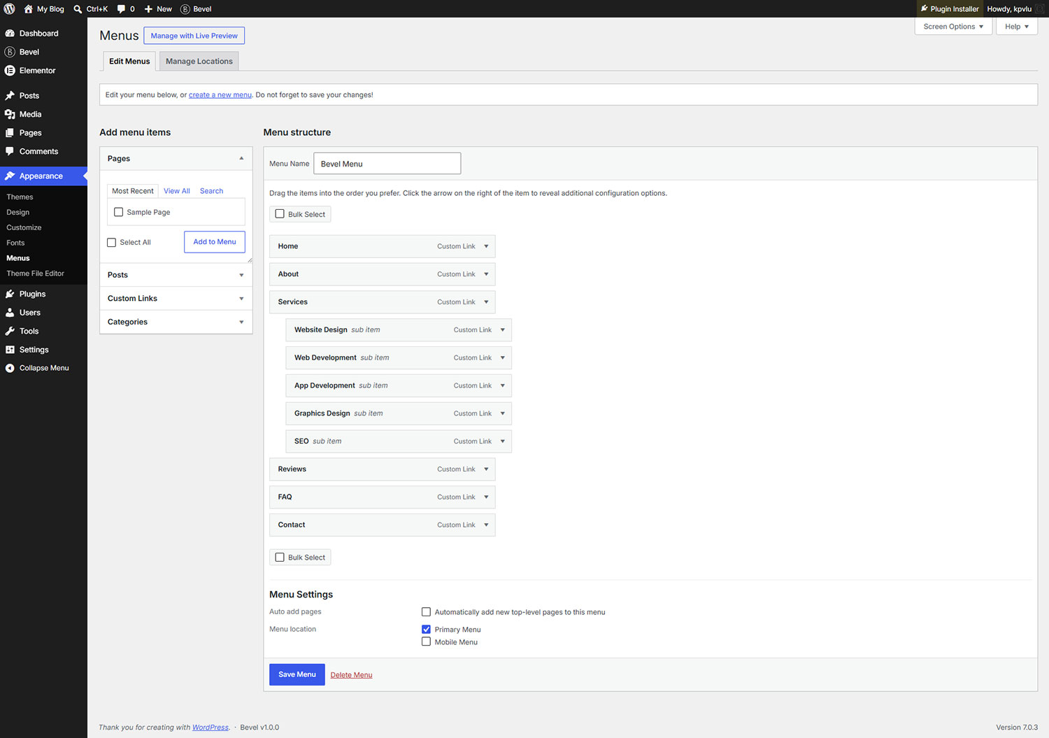
1. Build the menu in WordPress
- Go to Appearance, Menus in wp-admin.
- Click create a new menu, give it a name (for example "Main"), and click Create Menu.
- From the left, add Pages, Posts, Custom Links, or Categories to the menu.
- Drag items to reorder them. Drag an item slightly to the right, under another, to make it a sub-item (this becomes a dropdown).
- Under Menu Settings, Display location, tick Primary Menu to set this as your main navigation. If you want a different menu on phones, create a second menu and assign it to the Mobile Menu location.
- Click Save Menu.
Bevel registers two menu locations for you, Primary Menu and Mobile Menu, so the Nav Menu widget can fall back to them automatically.
2. Display it with the Nav Menu widget
Menus appear on the front end through the Nav Menu widget inside an Elementor header. Edit your header (see Edit Header and Footer), drag in the Nav Menu widget, and choose your menu under Menu. If you leave it on the default, the widget uses whatever menu is assigned to the Primary Menu location.
For the responsive panel, the widget has its own Mobile Menu selector. Pick a dedicated mobile menu there, or leave it and Bevel falls back to the menu assigned to the Mobile Menu location (and then to the primary menu). The widget handles the toggle, panel, and breakpoint for you. Style the items, dropdowns, and mobile panel from the widget's Style tab.
3. Add dropdowns and mega menus
Nested menu items appear as dropdowns automatically. For a full-width, visually designed panel on a menu item, build a Mega Menu template and attach it to the item under Appearance, Menus.
Create a separate, shorter menu for mobile if you like, then select it as the widget's mobile menu. The Nav Menu widget handles the mobile panel, toggle, and breakpoint for you.
Frontend Edit Buttons
While you browse your own site logged in, Bevel floats a small pencil button over each Elementor area — the header, the footer, and the page. Click one to open that area's Elementor editor in a pop-up, without leaving the page you're looking at.
How it works
- A pencil appears at the top-right of every Elementor document on the page. Its tooltip names the area — Edit Header, Edit Footer, or Edit Page.
- Hover a pencil to highlight the exact area it edits with a glowing outline, so you always know what you're about to open.
- Click it to open that area's Elementor editor inside a near-full-screen pop-up. Close it with the ×, a click outside, or Esc — the page then reloads so your changes show straight away.
- Each pencil sticks to its area as you scroll and automatically stays clear of a sticky header.
Who can see them
The buttons are only ever shown to logged-in users who can edit content — regular visitors never see them. They are also hidden on mobile, and never shown inside the Elementor editor itself.
Turning it on or off
Go to Bevel → Site Settings → Settings and use the Frontend Edit Buttons switch. It is on by default.
Because the buttons only load for logged-in editors, they never appear in your page cache and add nothing to what visitors download. To design the areas they open, see Edit Header & Footer.
Meta Description
Set the search-engine description for any page, right where you edit it. Bevel adds a simple Meta Description field so you get clean, per-page descriptions even without a separate SEO plugin.
Where to find it
- In Elementor: open Page Settings (the gear icon) → General Settings. The Meta Description field sits directly below Excerpt.
- In the WordPress editor: a Meta Description box appears in the sidebar of any Page.
Both edit the same value, so you can use whichever editor you're already in — they always stay in sync.
Writing a good description
Aim for around 160 characters. The counter shows your length and gently flags when you go past the recommendation, but there is no hard limit — write what reads best. Bevel prints your text as the page's <meta name="description"> tag in the page head.
The field only appears when no dedicated SEO plugin (Yoast, Rank Math, All in One SEO, SEOPress, and others) is active. Those plugins manage descriptions themselves, so Bevel steps aside to avoid printing a duplicate.
Multilingual (Polylang)
Bevel plays nicely with Polylang for multilingual sites. When Polylang is active, Bevel makes sure each language shows its own translated Elementor header, footer, and other Theme Builder templates.
What it does
Elementor's Theme Builder normally serves one header and footer for a location regardless of language, so a translated page could end up showing the default language's header. With Polylang active, Bevel swaps each Theme Builder template for its translation in the page's language — so headers, footers, and other templates always match the content the visitor is reading.
Turning it on or off
When Polylang is active, a Polylang Header & Footer switch appears under Bevel → Site Settings → Settings. It is on by default. On single-language sites the option is hidden, since it has nothing to do.
Setting up translations
- Install and configure Polylang, adding the languages you need.
- Make sure your Elementor header and footer templates are set to translatable in Polylang, then create a translation of each for every language.
- Keep the Polylang Header & Footer switch on. Bevel then shows the correct template for each language automatically — no per-page setup needed.
This applies to Elementor Theme Builder locations — headers, footers, and other theme templates. Your page and post content is translated by Polylang as usual. To build the templates it swaps, see Edit Header & Footer.
Pro Widgets
Bevel Core includes all Elementor Pro functionality on top of the free Elementor plugin, so your editor gains the entire Elementor widget library, from the free Basic set to every Pro, Theme Builder, and WooCommerce widget. Here is the full list, grouped by Elementor's own categories.
The Pro, Theme Elements, and WooCommerce widgets come from Elementor Pro functionality that is built into Bevel Core, so there is no separate Elementor Pro purchase or license. Like Bevel's own widgets, the Pro ones appear when your account is connected and your plan is active. Bevel adds 13 more of its own, listed under Bevel Widgets.
Basic widgets
The core building blocks, available on every install with the free Elementor plugin.
Pro widgets
The premium widgets for marketing, media, forms, navigation, and payments.
Theme Elements
Dynamic widgets for building headers, footers, single posts, and archive templates in the Theme Builder.
WooCommerce widgets
Available when WooCommerce is active, for designing product, cart, checkout, and account pages.
These widgets are maintained by Elementor. For Bevel's own custom widgets, see Bevel Widgets.
Bevel Widgets
Bevel Core adds 13 premium widgets to Elementor. They behave like any Elementor widget: drag, drop, and style. This page covers how to find and add them, and what the license means for them.
Where to find them
Open any page in the Elementor editor and look in the widget panel. Bevel's widgets appear under the Pro category. Type a widget's name in the panel search to jump straight to it. Drag one onto the canvas and its options appear in the left panel under Content, Style, and Advanced tabs, exactly like native widgets.
The widget list
Advanced Tabs
Tabbed panels with icons or images.
Animated Word Roller
A rolling list of words after a lead-in title.
Circle Progress Bar
Animated circular progress indicator.
Highlight Heading
Headings with animated highlight shapes.
Image Accordion
Expanding image panels.
Image Compare
Before and after slider.
Image Marquee
Scrolling strip of images.
Info Box
Icon, title, text, and button box.
Marquee
Scrolling text or image ticker.
Nav Menu
Header menu with mobile panel.
Simple Accordion
FAQ accordion with schema.
Stacked Slider
Cards-effect image slider.
Timeline
Vertical milestone timeline.
The license and your widgets
Bevel is deliberate about this. When a license is not active, the premium widgets are hidden from the editor panel, so you cannot add new ones. Any widget you already placed keeps rendering perfectly on the front end. Nothing you built is removed or degraded. Connect an active license to add new premium widgets again.
Every widget supports the full range of Elementor style controls in addition to its own options. The pages that follow highlight the options unique to each widget, not the standard Elementor spacing, background, and border controls that all of them share.
Advanced Tabs
Tabbed content panels where each tab can carry an icon or image and show either rich content or a picture. A more capable take on Elementor's default Tabs.
What it does
Organize content into tabs that visitors click to switch between. Each tab holds a WYSIWYG content area or a single image, and can display an icon or thumbnail alongside its label. Great for feature comparisons, product details, and FAQ-style sections.
Key options
Layout
- Layout: Horizontal or Vertical tab arrangement.
- Enable Icon and Icon Position: show an icon per tab, stacked above the label or inline beside it.
Tabs repeater
Add as many tabs as you need. Each tab item offers:
- Set as Default: which tab is open on load.
- Icon Type: None, Icon, or Image, plus the icon or image and its size.
- Tab Title: the label (supports dynamic values).
- Content Type: Content (a WYSIWYG editor) or Image (with image size, caption source, link, and lightbox).
Tag control
Tab Title HTML Tag lets you choose the heading element for titles from h1 to h6, div, p, or span. This keeps your document outline correct for accessibility and SEO.
Styling
Style tab titles (typography, min width in vertical mode, icon size and gap), and set separate looks for Normal, Hover, and Active states including background with gradients, text and icon color, border, and radius. You can style the content area and an optional caret that points at the active tab.
The vertical layout can be set to collapse responsively, so a side-by-side tab set on desktop stacks neatly on smaller screens. Tab content also runs shortcodes.
Animated Word Roller
A fixed lead-in title followed by a vertical list of words that rolls through, emphasizing the active word while its neighbors fade. Perfect for headlines like "We build fast, bold, memorable websites".
Key options
- Title: the fixed text that precedes the rolling words.
- Word Lists repeater: add each rolling word, with an optional inline icon per word.
- Title HTML Tag: choose from H1 to H6 or div for correct document structure.
- Alignment: left, center, or right, set per device.
- Active Word Duration: how long each word stays centered, in seconds (1 to 10).
- Visible Word: how many words show at once (1 to 50). An odd number keeps the active word centered.
Styling
Style the title and the animated words separately, each with typography, color, and a text stroke option. Icons have their own size, gap, and color.
Set Visible Word to an odd number that is less than or equal to your total number of words. The editor shows a gentle reminder if it is not, so the active word lands in the middle.
Circle Progress Bar
An animated circular progress ring drawn with SVG. Use it for skills, stats, completion rates, or any figure you want to present as a share of a whole.
Key options
- Progress Value: the target percentage (default 75). Supports dynamic values.
- Duration: how long the fill animation takes, in seconds.
- Before, Middle, and After Text: labels around the ring. If you leave Middle Text empty, the animated percentage number is shown in the center instead.
Styling
- Circle Size: the diameter, from 50 to 500 pixels.
- Fill Color: the unfilled track color.
- Stroke Color and Stroke Width: the progress arc's color and thickness.
- Stroke Cap: Rounded, Square, or Butt ends for the arc.
- Independent color and typography for each label.
The ring includes proper accessibility roles so screen readers announce it as a progress indicator with its value.
Highlight Heading
Build a heading from inline parts and draw an animated highlight around the words that matter, an underline, a circle, a zigzag, or a hand-drawn stroke. Parts can also be icons or images.
Key options
Content repeater
Assemble the heading from a sequence of parts. Each part is a Type of Text, Icon, or Image.
- Text parts can carry a Highlight Style: None, No Stroke (color only), Curly, Circle, Circle 02, Zigzag, Curve Up, Curve Down, Underline 01, Underline 02, Underline Double, Underline Dashed, Top Bottom Line, or Cross X. You control the stroke color, text color, and an optional text background.
- Icon parts have their own color, background, padding, and radius.
- Image parts support a size and border radius.
Heading setup
- Alignment: left, center, or right, per device.
- HTML Tag: H1 to H6, div, span, or p.
Shape and animation
Fine-tune the highlight with stroke width, vertical and horizontal offset, and shape height. Turn the draw-on Animation on or off and set an animation delay in milliseconds, so highlights appear as the reader reaches them.
Highlight Heading ships 13 hand-drawn shape presets. Mix text, icon, and image parts in a single heading for expressive titles.
Image Accordion
A row of image panels. The active panel, opened on click or hover, expands to reveal its title, description, and an optional button. A striking way to present services, portfolios, or categories.
Key options
- Images repeater: each panel has an image, title, WYSIWYG description, and an optional button with text and link.
- Active Behaviour: Click or Hover to expand a panel.
- Heading Tag: H2 to H6 for the panel titles.
- Title alignment: horizontal (start, center, end) and vertical (top, center, bottom), set per device.
Styling
Control panel height, the gap between panels, and border radius. Add an overlay color for normal and hover with gradients, apply CSS filters, and style the title, description, and button independently, including a rotated vertical title orientation.
In Click mode, panels are keyboard-focusable and operable with Enter or Space, so the accordion is usable without a mouse.
Image Compare
A before-and-after comparison with a draggable divider. Ideal for edits, retouching, renovations, and any "then versus now" story.
Key options
- Compare Style: Horizontal or Vertical divider.
- Slider Position: where the divider starts, from 0 to 90 percent.
- Before Image and After Image, each with its own image size.
- Before Text and After Text labels (default BEFORE and AFTER).
- Before and After Position: which image sits on which side.
- A handle Icon for the divider grip.
Styling
Set the handle icon size and color, the slider and separator colors, separator width and alignment, and full label styling including position, typography, color, background, border, radius, and spacing.
Image Marquee
A continuously scrolling strip of images that loops seamlessly, horizontally or vertically. Perfect for logo walls, partner rows, and galleries in motion.
Key options
- Add Images: a gallery, with an image size and per-device gap control.
- Link and Lightbox: link images to their file or a custom URL, with lightbox options.
- Caption: show None, Title, Caption, or Description under each image.
- Lazy Load: defer offscreen images.
Marquee options
- Show Vertical: scroll up instead of across.
- Reverse: flip the scroll direction.
- Pause On Hover: stop scrolling while hovered (on by default).
- Speed: a scroll speed from 1 to 100 (default 10).
- Edge Shadow: a soft fade at the edges, with color, size, and blur.
Styling
Set image alignment, width and height, an optional section height in vertical mode, box shadow, CSS filters for normal and hover, and border and radius. Captions have their own alignment, color, background, typography, and spacing.
The animation starts moving at the configured speed on first paint, without waiting for scripts, then refines itself once images load. The duplicated loop track is hidden from screen readers and keyboard tabbing to avoid repeats.
Info Box
A flexible box that combines an icon, image, or number with a title, description, and optional button. The workhorse for feature grids, services, and calls to action.
Key options
- Type: None, Text, Icon, or Image for the media element, with its size or the icon or number.
- Position: place the media Left, Top, Right, or Bottom, per device. Left and Right add an Inline Icon option and vertical alignment; Bottom adds a Media Placement choice of Below Description (default) or Below Button.
- Title (dynamic) and Description (WYSIWYG), with a Title HTML Tag from H1 to H6, div, span, or p.
- Alignment: left, center, right, or justify.
- Global Link: make the whole box, the image or icon, or the title clickable, or enable a dedicated button with its own text, icon, and position.
Styling
Style the icon or image (size, offset, background, border, radius, rotation, and hover), the title and description (colors, hover, typography, spacing), and the button fully, including a normal and hover state, a button icon, and Elementor hover animations.
Because you can make the entire box a link, Info Box doubles as a clickable card for services, categories, or blog highlights.
Marquee
Horizontally scrolling text or images in a ticker or announcement style, with dividers between items. Use it for promos, brand statements, or a moving strip of logos.
Key options
- Marquee type: Normal text, Separate Text, or Image.
- Normal: a single line of scroll text.
- Separate Text: a repeater of phrases, each with an optional custom color, typography, shadow, and stroke.
- Image: a repeater of images, each with a link.
- Scroll Direction: right to left or left to right.
- Animation Duration: the loop time in seconds.
- Divider Type: Default, Text, or Icon between items.
- Pause On Hover and Clone count for a seamless loop.
- Edge Shadow: a fade at the ends, with a color.
Styling
Style the text (margin, color, typography, shadow, stroke, background), the divider (size, typography, spacing, color), and images (gap, size, background, radius, and rotation).
Simple Accordion
A lightweight FAQ and toggle accordion with several animation styles, optional FAQ schema for search engines, and the ability to pull content from an existing section by ID.
Key options
- Items repeater: each item has a title, a per-item icon, and a Source of Custom Content (a WYSIWYG editor) or a Section ID (to reuse an existing element's content). Titles accept basic HTML, such as <strong>, <em>, <span>, and <br>.
- Title HTML Tag and separate open and active icons.
- Show Title Icon and Show Number Counter: prefix every title with an automatic number in the format you choose — 1., 01., 1, 01, 1), or (1).
- Collapse All Items and Multiple Open: whether items start closed and whether more than one can be open at once.
- Active Item: which item is open on load.
- Hash Location and Scrollspy: deep-link to an item and scroll to it, with offset and timing.
- FAQ Schema: output structured data so your questions can appear in search results.
Animations and styling
Pick an accordion animation (None, Basic, Slow, Expand, or Overshadow) and an icon animation (None, Fade, Spin, or Slide) with a rotation angle. Style items, titles, icons, and content for normal, hover, and active states. When the Number Counter is on, the Title style tab adds its own Counter Color (per state), Counter Typography, and Counter Spacing.
Simple Accordion is fully keyboard accessible, with correct ARIA roles and states. Use the FAQ Schema option on one accordion per page for best search results.
Stacked Slider
An image slider with a cards effect. The gallery stacks like a deck and swipes through with a subtle rotation. Clean, tactile, and focused on the imagery.
Key options
- Choose Images: the gallery for the deck.
- Dots: show pagination dots (on by default).
- Autoplay: advance automatically (on by default).
- Animation Speed: the autoplay delay, from 500 to 10000 milliseconds.
Styling
Set the box background, image alignment, width, and padding, and the dot colors, active color, distance, and alignment.
Stacked Slider uses Elementor's bundled Swiper engine, so it adds no extra slider library to your page. With no images set, it shows a placeholder deck in the editor.
Timeline
A responsive vertical timeline for milestones, history, roadmaps, and processes. Each entry can carry an icon or image, a date or time, a title, content, a gallery, and a button.
Key options
- Timeline repeater: each entry has its own Content and Style tabs.
- Content: icon or image, a Calendar or Text date, title, gallery, image position, WYSIWYG content, and an optional button.
- Style: per-entry colors for content, arrow, background, border, shadow, and the icon box.
- Show Date, Show Time, Show Content Arrow: toggle each element.
- Title HTML Tag and Icon Box Alignment.
- Tree Alignment: Left, Center, or Right layout for the connecting line.
- Show Scroll Tree: animate the timeline line as the reader scrolls.
Styling
Style the content box (typography, colors, arrow, background, border, shadow, radius, spacing), the icon box (size, spacing, background, border, icon and tree colors), the title, the date and time headings, and the button.
On desktop, a center-aligned tree alternates entries left and right. On tablet and mobile it collapses to a single column automatically.
Starter Sites
A library of ready-made, professionally designed websites you can import in a couple of clicks and then customize. The fastest way to go from a blank install to a real site.
Browsing the library
Open Bevel, Starter Sites. The catalog is fetched from the Bevel library and cached, so browsing is fast. Everything happens without page reloads:
- Search by name.
- Filter by Availability (Free or Pro), Category, and Type (One-page Website or Full Website).
- Sort by Newest, Popular, or A to Z.
A header action lets you sync the catalog on demand.
Importing a starter site
When you import, a confirmation explains exactly what will happen before anything changes:
- Pages, templates, menus, content, and images are added.
- Any plugins the template needs are installed from WordPress.org and activated.
- Global colors and fonts are replaced with the template's.
- Nothing existing is deleted.
A progress view walks through Preparing site, Importing templates, and Finalizing setup, then offers to view your new site.
Free templates import on any connected plan. Pro templates need a paid plan; selecting one on the free plan opens an upgrade prompt. Connect your account first to import anything.
Import & Export
Package an entire site, its settings, templates, pages, menus, content, media, and required plugins, into a single "site kit" ZIP, and import it into another install. Perfect for migrations, staging to live, and reusing a base setup.
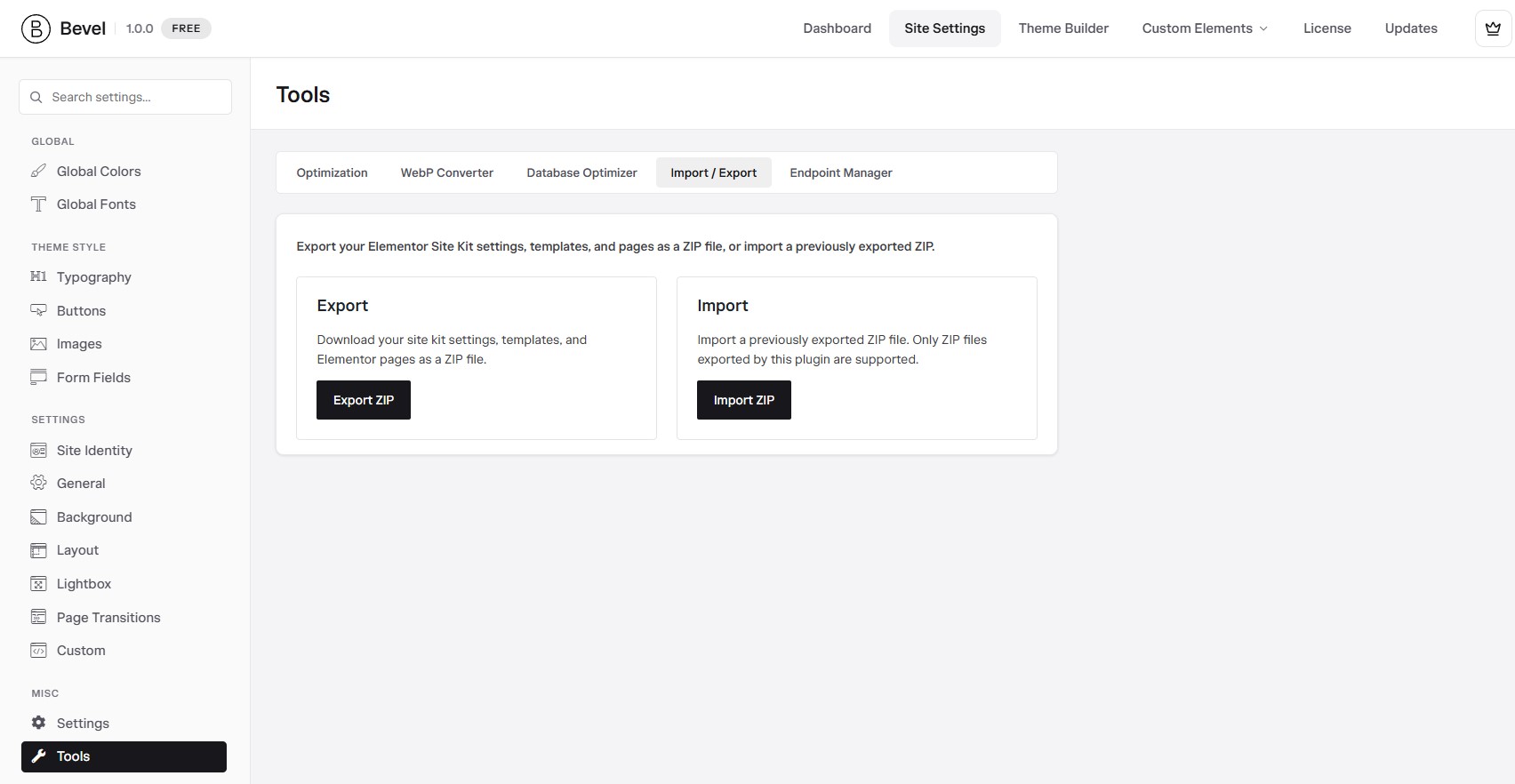
Exporting a site kit
Open Bevel, Tools, Import / Export and choose Export ZIP. A modal lets you pick exactly what to include, each with a per-item selection list:
Site Settings
Your global colors, fonts, and layout.
Templates
Chosen library templates.
Pages
Pages built with Elementor.
Menus
Selected navigation menus.
Content
Posts and custom post types with taxonomies, fields, and featured images.
Required Plugins
Recorded so the import can install them.
Referenced media originals are bundled. Images are limited to common web formats for safety.
Importing a site kit
Drag a previously exported ZIP onto the Import card, or use the file picker. A modal lets you choose what to bring in, and offers two careful, opt-in actions:
- Clean Elementor Templates: move existing library templates to Trash before importing.
- Trash All pages, posts: move existing posts and pages to Trash before importing (recoverable).
The import runs in a safe order: media first, then plugins, settings, content, templates, and pages, followed by a pass that relinks internal URLs and template references to the new content. A progress bar keeps you informed.
The two "Trash" options are always off by default and reset every time you open the import dialog. They are recoverable, but treat them with care on a site that already has content.
WooCommerce
When WooCommerce is active, Bevel restructures the shop markup so your store inherits Bevel's clean styling and works smoothly with Elementor.
What Bevel adds
- Declares WooCommerce theme support.
- Removes the default sidebar and content wrappers for a full-width, Elementor-friendly layout.
- Moves the breadcrumb into the single-product summary and hides the default shop page title.
- Wraps shop-loop items, product images, and add-to-cart buttons in Bevel containers for consistent styling.
- Moves the star rating above the product title.
- Adds controls for products per page and grid columns, plus Bevel button styling.
This is a layout and markup integration, so there is no separate settings screen. Install WooCommerce and Bevel adapts your store automatically. Note that the page cache never caches cart, checkout, or account pages.
Bevel Extras
Beyond the widgets and tools, Bevel Core weaves extra controls into Elementor and adds a set of quality-of-life features that make everyday building faster and richer.
Animated Background
On any Container or Section, open Background and turn on Animated BG to add a live, animated background. Pick an Animation from a large grouped library:
Styles
Lightweight CSS animations: Style 1 through Style 5.
Gradients
Fluid Gradient, Borealis, Gradient Mesh, Mist, Mystic Lake, Noir Haze, Void Wave, Halftone.
Lights
The Shining, Phase Tunnel, Plasma Line, Light Strings.
Shapes
Flame, Pulse Bubble, Neon Eclipse, Echo Sphere.
Images
Liquid Mask and Liquid Image, which animate your own picture.
Others
Bit Wave, Flux Stripes, Perspective Grid.
An Animation Settings popover fine-tunes the look, with only the relevant options shown per animation: Scale, Intensity, Speed, Disable Motion, Stop Frame, Noise, Angle, Offset X and Y, interactivity, and up to several colors. The scripts for an animation load only when you actually use it.
Animated Border
Give a Container (or other element) a moving border. Under Border, set a normal border first, then choose an Animated Border style:
- Hover Glow lights the border on hover.
- Rotate, Gradient Rotate, and Gradient Rotate (2) sweep a single or dual-color gradient around the edge.
- Multicolor Rotate with 4, 8, or 12 colors for a rainbow edge.
Set up to four Animated Border Colors and the Speed in seconds.
Sticky Header
When a Container is used as the page header, a Sticky Header switch (on by default) fixes it to the top of the screen after scrolling. Give the stuck state its own Background Color, or turn on Advanced Background for a full classic, gradient, or image background.
Enhanced widget controls
Bevel quietly extends many stock Elementor widgets with extra controls:
Button
A dedicated Icon style section: size, scale, spacing, color, background, rotate, border, shadow, radius, and padding, for normal and hover.
Heading
Span Text Styles: separate typography and a color or gradient for the highlighted <span> parts of a heading. Plus Scroll Reveal Fill (see below).
Icon List
Columns and grid gaps, an inline gap, a link hover underline, plus background, border, radius, and padding for items and icons.
Icon Box
A Custom Image alternative to the icon (with position, size, and object fit) and Content Top Spacing.
Image Box
Content Top Spacing to fine-tune the gap above the title.
Text Editor
Link Styles: typography and a border for links inside the text.
Form
Advanced gaps, field padding, and full success, error, and inline message styling (colors, border, radius, and spacing).
Nested Accordion
Item background, border, and border radius.
Nested Carousel
A seamless Marquee mode with an optional edge shadow.
Video
An optimized YouTube mode: a light thumbnail with click-to-play and lazy loading, for a faster first paint.
Scroll Reveal Fill (Headings)
On any Heading, open the Style tab and turn on Fill on Scroll in the Scroll Reveal Fill section. The text starts in a muted colour and fills with your brand colour line by line as it scrolls up the page — the effect that normally needs a scroll library like GSAP, built in with no extra scripts. It runs live in the Elementor editor, respects the visitor's reduce motion setting, and re-splits itself when the layout reflows.
Fill on Scroll
The master switch that enables the effect for that heading.
Fill Color / Unfilled Color
The colour the text fills to, and the faded colour it starts from. Default to the Primary and Light global colours.
Fill Speed
How much scrolling each line takes to fill. Lower is slower (default 0.1 ≈ ten times slower than 1); lines still reveal one at a time.
Start Offset
Where in the viewport the first line begins filling. The 90% default starts it just after the line appears at the bottom.
Finish Before Hiding
If a slow line has not filled by the time it nears the top, it speeds up so the whole text is readable before it scrolls off. On by default.
Plain-text headings (line breaks are fine) fill line by line; a heading that contains inline markup, such as a two-tone <span>, fills as a single block instead.
Custom Icons
Seven icon libraries, Bevel, Themify, Remix, Lucide, Iconic, Feather, and Hero, appear as extra tabs in Elementor's icon picker and render as crisp inline SVG. Toggle each library in Site Settings. Altogether they give you over 7,130 icons:
Bevel Custom Fonts
A curated set of bundled local font families, such as Satoshi, Circular Std, and General Sans, added to Elementor's typography control and served from your own server. Enable it under Bevel, Settings, General. Local serving is good for privacy and speed.
SVG uploads
Administrators can upload SVG files safely. Bevel sanitizes them on upload, strips scripts, and fixes SVG metadata so they behave like normal images in WordPress and Elementor.
Post Duplicator
Adds a Duplicate action to posts, pages, and custom post types. A small dialog lets you set the new title, slug, and status, and copies content, meta, taxonomies, and the Elementor layout. Toggle it in Bevel, Settings, General.
Widget Tooltip
Adds a Tooltip section to the Advanced tab of common Elementor widgets, with content, placement, behavior, and styling. The tooltip library loads only when a tooltip is actually used.
Wrapper Link
Adds a Wrapper Link control to sections, columns, containers, and common widgets, making the entire element clickable. Ideal for clickable cards and banners.
Form email template
When an Elementor Pro form sends its notification as HTML, Bevel replaces the plain body with a clean, branded email template automatically. Instead of a bare list of field values, the recipient gets a styled message with your site logo, the form name, and every submitted field laid out in a readable table.
Bevel Branded Email Template switcher
The branded template is controlled per form, so you can keep it on your contact form and turn it off for a form that feeds another system.
- Edit the page containing your form with Elementor and select the Form widget.
- Open the Content tab and expand the Email section.
- Find Bevel Branded Email Template and set it On or Off.
- Update the page.
The switcher is on by default, and forms built before this option existed keep the branded template, so nothing changes unless you turn it off. Switching it off returns that form to Elementor's default email body.
What it applies to
The template is used for notifications whose Send As is set to HTML. If a form sends as Plain, the branded template is skipped and the plain text body is sent as usual, whatever the switcher says.
The setting covers the whole form, including both the Email and Email 2 actions. Turning it off disables the branded template for every notification that form sends.
The template picks up your site logo automatically. Set one under Appearance, Customize, Site Identity or in Elementor's Site Settings, and it appears at the top of every branded form email. Without a logo, your site name is used instead.
One-Click Optimization
The simplest path to a fast site. One button applies Bevel's recommended performance settings, enabling font optimization, JavaScript delay, WebP conversion, and caching in a single guided run.
What it does
Open Bevel, Tools, Optimization and click Start Optimizing. A guided run works through four steps, showing progress as it goes. It is resumable, so it survives a page reload and can continue in the background:
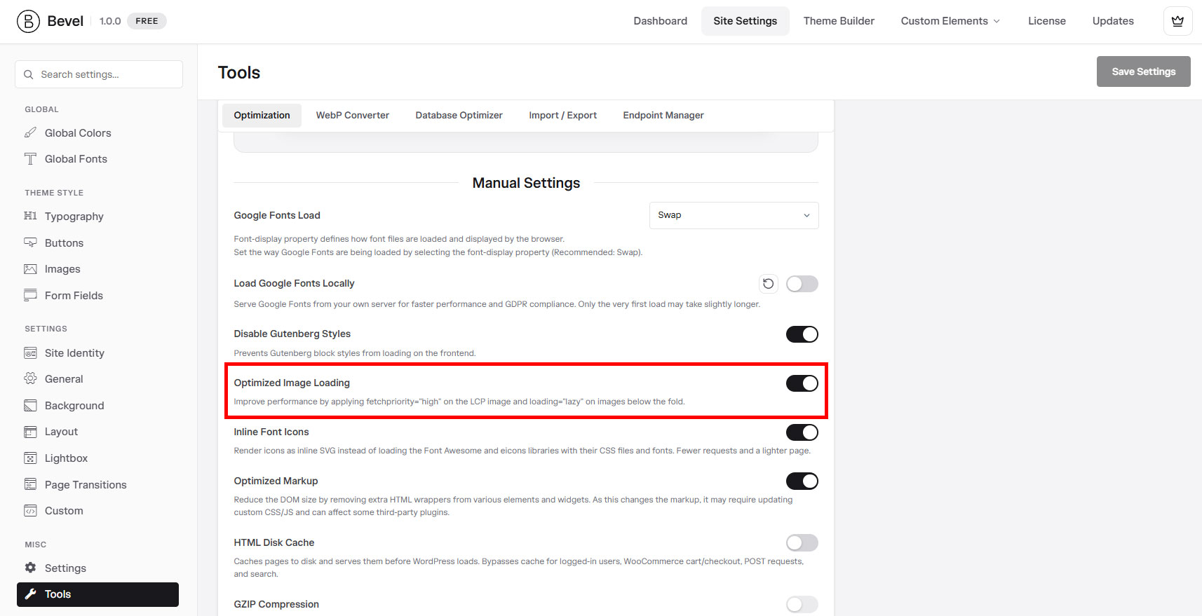
- Change required settings: sets font display to swap, hosts Google Fonts locally, disables unused block styles, and turns on optimized image loading.
- JavaScript Delay: enables Bevel's delay engine so scripts load after the first interaction.
- Convert images to WebP: converts eligible images, then turns on WebP serving. This step carries most of the progress.
- Enable cache: turns on the HTML disk page cache and GZIP.
When it finishes, each step is shown as Completed or Inactive based on your live settings, so you always know the current state.
One-Click Optimization is a licensed tool, so an active Bevel license is required. Each underlying tool can also be controlled on its own if you prefer to tune things manually.
Page Cache
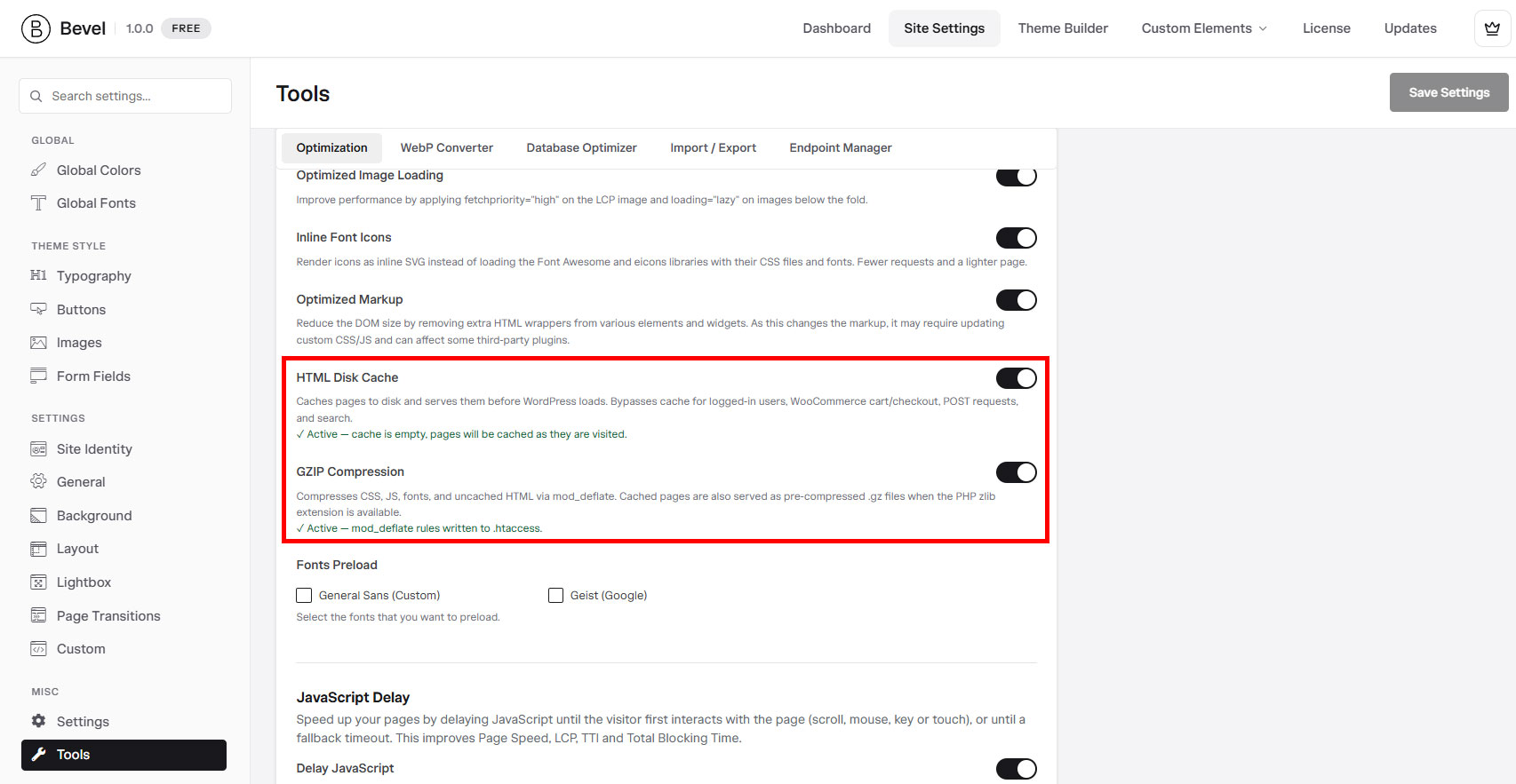
A disk-based full-page cache that serves saved HTML to visitors before WordPress even loads, for a dramatic speed boost on content that does not change per visitor.
Turning it on
Open Bevel, Settings, General and turn on HTML Disk Cache, and optionally GZIP Compression. It is off by default, so caching is always your choice. One-Click Optimization can enable it for you.
What it caches, and what it never caches
The cache stores rendered HTML per URL and serves it directly on the next visit. To keep sites correct, it automatically bypasses:
- Logged-in users.
- WooCommerce cart, checkout, and account pages, and any non-empty cart.
- POST requests, AJAX, cron, and REST.
- Search results, feeds, and sitemaps.
- Pages with meaningful query parameters (common tracking parameters are ignored so those pages still cache).
Preloading and invalidation
A background preloader warms the cache from your sitemap, so visitors hit warm pages. The cache clears itself automatically when you edit posts, terms, menus, the theme, plugins, or Elementor content, so visitors never see stale pages. An admin-bar menu lets you purge on demand.
Bevel's cache detects other caching plugins (WP Rocket, W3 Total Cache, LiteSpeed, and many more) and refuses to enable alongside them, so two caches never fight. Use one cache at a time.
WebP Images
Convert your JPG and PNG images to WebP, a modern format that is much smaller at the same quality, and serve them automatically to browsers that support it.
Converting your library
Open Bevel, Tools, WebP Converter. Stat cards show how many images you have, how many are converted, the percentage done, and the space saved.
- Generate WebP: convert your media library in batches.
- Regenerate WebP: delete all existing WebP files and convert again from scratch.
- Convert WebP on upload: automatically make a WebP version of every new image.
Serving WebP
Turn on Serve WebP on frontend to swap JPG and PNG for WebP in images, srcset, thumbnails, blocks, and Elementor backgrounds, with a safe fallback to the original for browsers that do not support WebP.
Quality and exclusions
Set the JPEG and PNG conversion quality (defaults are 75 and 80). Under Manage Exclusions you can disable conversion per file type and exclude specific directories.
Database Optimizer
Clean out the clutter WordPress accumulates over time, revisions, drafts, spam, orphaned data, and expired transients, and optimize your tables to keep the database lean.
How to run it
Open Bevel, Tools, Database Optimizer. It shows your database name and size and a per-table breakdown. Click Optimize Database and choose what to clean. Each option is a checkbox:
- Optimize database tables.
- Clean all post revisions.
- Clean all auto-draft posts.
- Clean all trashed posts.
- Remove spam and trashed comments.
- Clean orphaned post metadata.
- Clean expired transients.
Post deletions also remove their related meta, comments, and term links, so no orphans are left behind. The run is time-budgeted and tells you the space it freed.
Cleanups are safe and scoped to your site, but a fresh backup before a large cleanup is always a good habit. If a big run times out, it tells you to run it again to continue.
Image Preloading
Automatically preload the largest image at the top of a page, your hero, so it appears sooner. This directly improves the Largest Contentful Paint metric that search engines care about.
What it does
Image Preloading works together with Elementor's Optimized Image Loading option. Bevel reads a page's structure and finds the hero: the largest image in the first section. It then tells the browser to fetch that image early. It handles cases the browser cannot discover on its own, such as CSS background images and images set in custom CSS, which the browser's own scanner would otherwise miss.
Smart by default
- Only images above a real size threshold are preloaded, so small icons are ignored.
- The first preload is marked as high priority.
- When WebP serving is on, the preload points at the WebP version.
Forcing a preload
Every container and section gains a Preload Images switch in its Advanced tab. Turn it on to force Bevel to preload that element's images, useful when your key image is not the automatic pick.
Bevel Portal
Your Bevel account at my.wpbevel.com is where you manage everything outside WordPress: licenses, the websites you have activated, orders and invoices, your profile, and support.
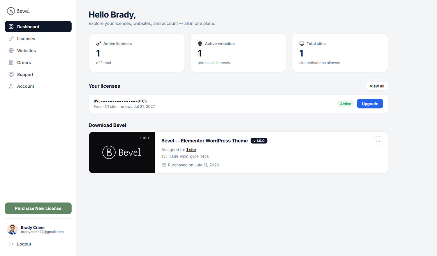
Signing in
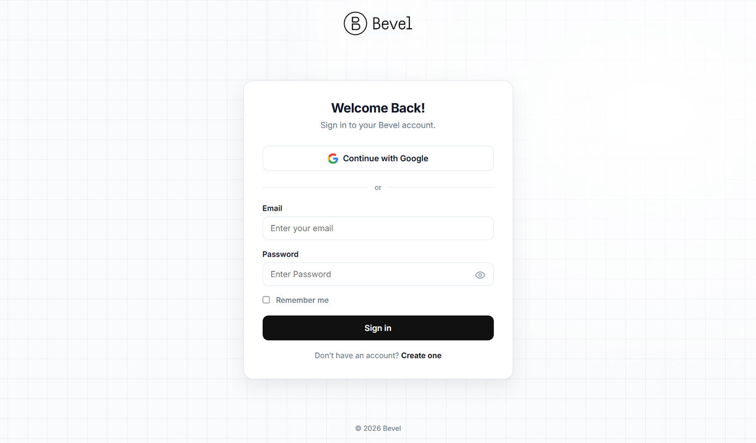
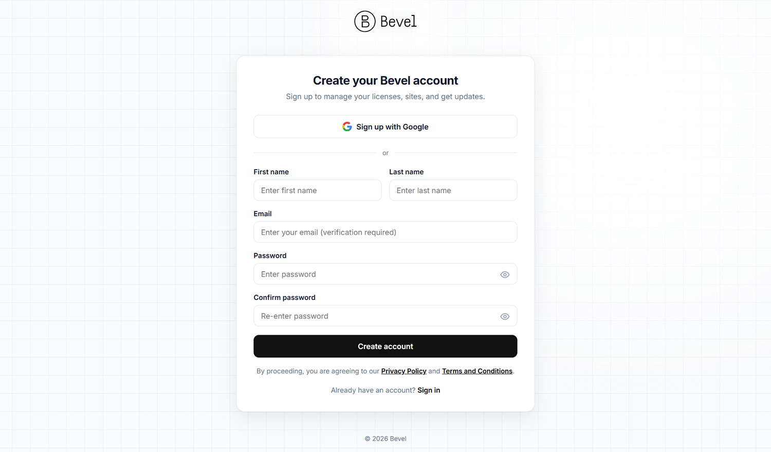
Sign in with your email and password, or with Google. The password fields have a show and hide toggle so you can check what you typed. Once in, you land on your account Dashboard.
The Dashboard
The Dashboard greets you with quick stats, active licenses out of your total, active websites, and your total site allowance, followed by your recent licenses and a card to download the Bevel theme.
Getting around
Licenses
Your keys, plans, and downloads.
Websites
Every site you have activated.
Orders
Purchase history and invoices.
Support
Open and track help tickets.
Account
Update your name, email, and password.
Licenses
See every license you own, download Bevel, and manage each license's plan, sites, and renewals.
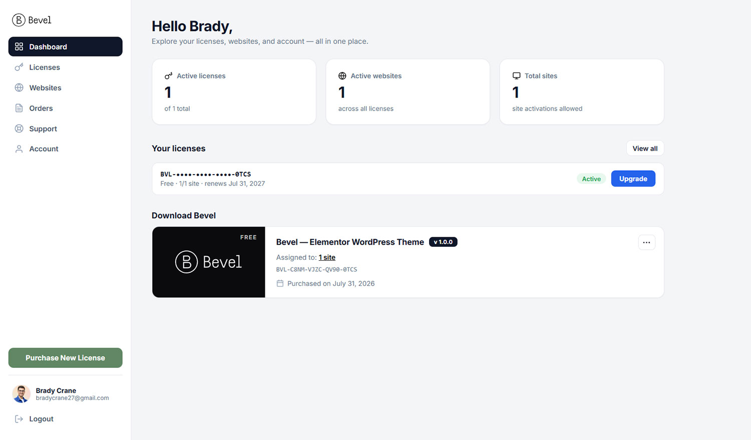
Your licenses
The Licenses page lists all your licenses. Each shows its masked key, plan, sites used out of the allowance, and renewal date or Lifetime. From here you can also download the theme and view your receipts.
License keys
Bevel license keys look like BVL-XXXX-XXXX-XXXX-XXXX. You rarely need to touch a key, because connecting is done by authorizing a site from your account, not by pasting a key. The key is there when you need it, for example to claim a license bought under a different email using the Claim a license by key form.
License detail
Open a license to see its full key, status, plan, sites used, and linked order and invoice. From here you can:
- Download the theme, subject to your plan's download window.
- Renew the license.
- Upgrade the plan (from a free license).
- See the active sites and remove any of them to free a slot.
A license covers the Bevel theme and its companion plugin together, so one license keeps both updated. Dev and staging sites do not use a site slot.
Websites
A single view of every website you have activated across all your licenses, so you always know where Bevel is running and can free a site when you retire it.
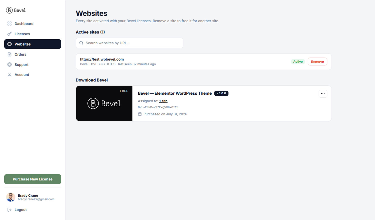
What you see
The Websites page lists your active sites and, separately, sites you have removed. A search box filters by URL, handy when you manage many installs. Development and staging sites are labeled and shown as free, since they never consume a slot.
Removing a site
Click Remove next to a site to release it. That frees the slot for another install. The site's live pages keep working; it simply stops receiving updates on its next check. You can also disconnect from within WordPress on the License page.
Orders & Invoices
Your complete purchase history, with downloadable receipts and tax invoices for your records.
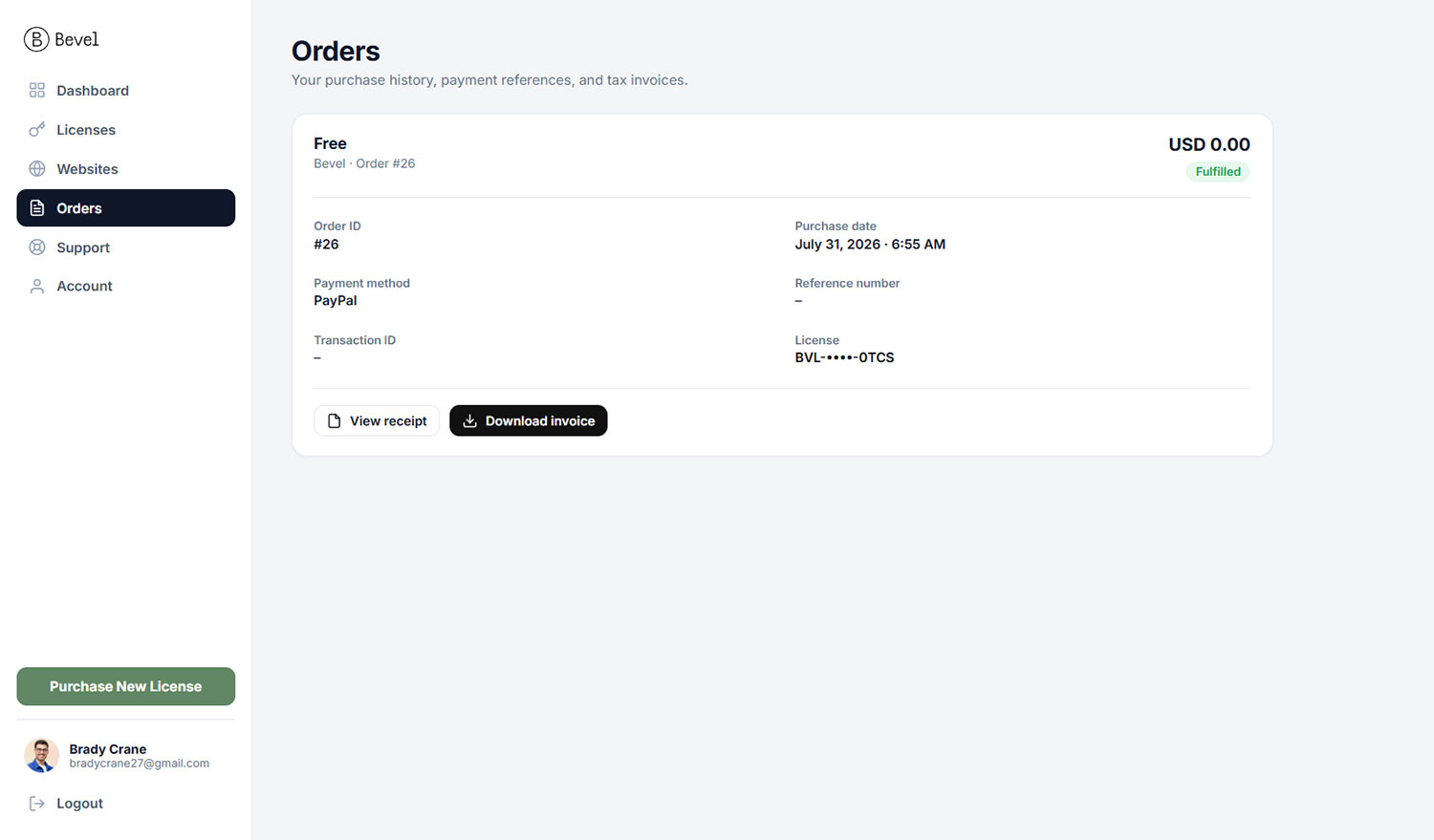
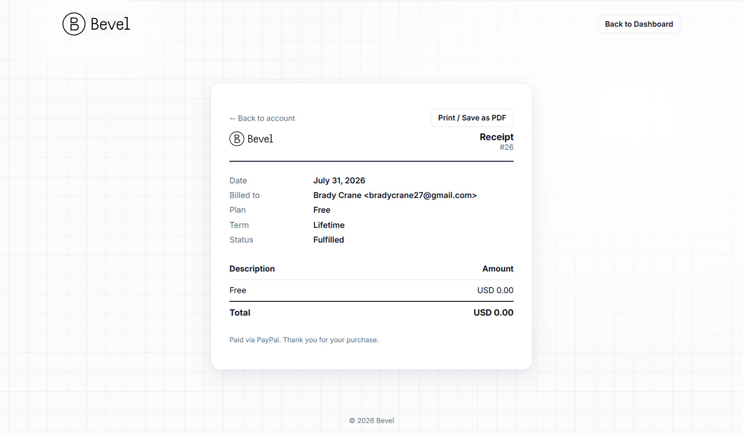
Order history
Each order card shows the plan, an Upgrade or Renewal tag where relevant, the amount, the status, the order number and date, the payment method, and the payment references. Orders link to the license they issued.
Receipts and invoices
From any order you can View receipt or Download invoice as a PDF. The invoice is a clean, itemized document suitable for accounting and tax, and it matches the on-screen version exactly.
Support tickets
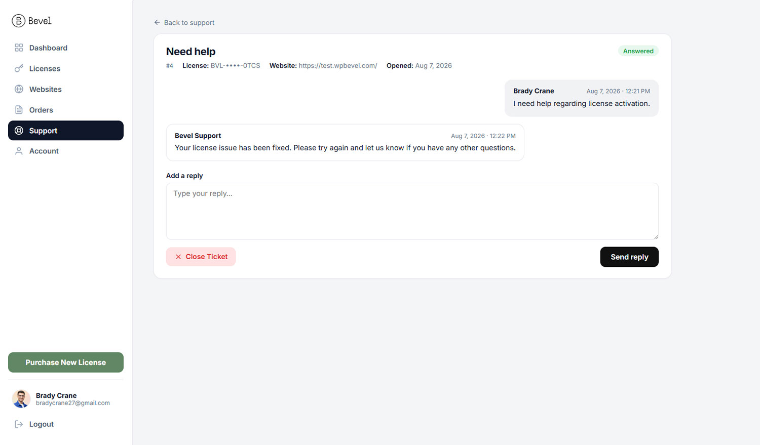
Get help directly from your account. Open a ticket tied to one of your licenses, exchange replies in a threaded conversation, and track its status, all with email notifications on both sides.
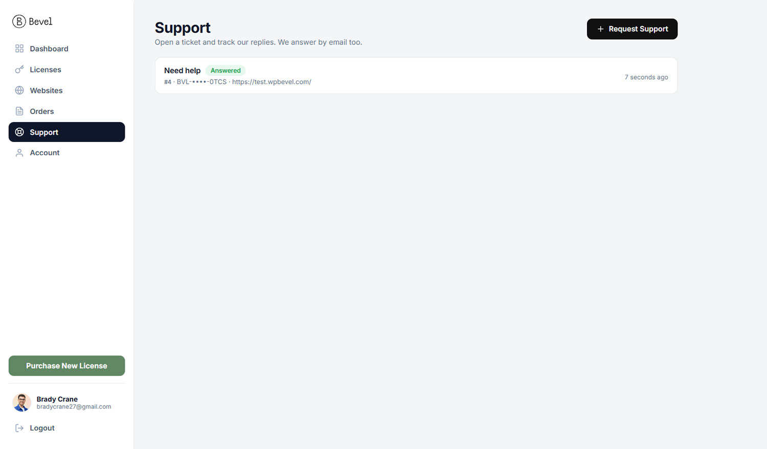
Opening a ticket
Go to Support and click Request Support. Fill in the form:
- Select License (required): the license your question relates to.
- Website URL (optional): the affected site.
- Subject and Detailed Description (required).
Submitting creates the ticket and emails both you and the support team.
Statuses
| Status | Meaning |
|---|---|
| Open | Waiting on support. This is a new ticket, or you just replied. |
| Answered | Support has replied and is waiting on you. |
| Closed | Resolved and archived. You can always open a new request. |
The conversation
Open a ticket to see the thread, your messages and the support team's, in order. Type a reply and send it, or use Close Ticket when your question is resolved. When support replies, a small count badge appears next to Support in the sidebar so you notice the new reply.
There is a limit on how many tickets you can have open at once (three by default). Close a resolved ticket to free up a slot for a new one. You will see a note if you reach the limit.
Troubleshooting
Quick fixes for the situations you are most likely to run into. If something here does not resolve it, open a support ticket.
The front end shows a setup screen
If logged-in admins see a "setup needed" or "account not connected" screen on the front end, the required plugins are not installed yet or no license is connected. Finish the Setup Wizard and connect your account. Visitors are never shown these screens.
Premium widgets are missing from the editor
If Bevel's widgets are not in the Elementor panel, your license is likely inactive. Open Bevel, License and connect or refresh it. Widgets you already placed keep rendering regardless; this only affects adding new ones.
The page is not rendering correctly (styles missing, Elementor CSS not loading)
This is the most common fix, and it is one click. In the WordPress admin bar, open Bevel, Clear Cache. It regenerates Elementor's CSS files, clears the Google Fonts cache, purges Bevel's HTML page cache (and re-warms it), and flushes any third-party cache plugin it detects. Use this whenever a page looks unstyled, a widget's styles are missing, a font is not applying, or Elementor CSS does not load.
A content change is not showing
If a recent edit is not visible, the page is being served from cache. Bevel clears the cache automatically on edits, but after bulk changes use Bevel, Clear Cache in the admin bar, or toggle HTML Disk Cache off and on under Bevel, Settings, General.
Fix an Elementor 500 error
A 500 error in the editor or on the front end is often caused by a bloated or corrupted database (excess revisions, transients, and orphaned rows). Clean it up under Bevel, Site Settings, Tools, Database Optimizer: run Optimize Database with the revisions, transients, and orphaned-metadata options checked, then reload. If it persists, raise your PHP memory limit and try again.
Cannot enable the cache
If the HTML Disk Cache will not turn on, another caching plugin is probably active. Bevel refuses to run two caches at once. Disable the other cache plugin, or keep using it instead.
Images look wrong after WebP
If images appear broken after enabling WebP, use Regenerate WebP to rebuild them, and confirm your server supports WebP. Bevel falls back to the original format for browsers that do not support WebP.
Updates will not install
If Update Now opens an upgrade prompt instead of updating, your plan's update window has ended or you are on the free plan. Renew or upgrade to restore in-place updates. You can still download the latest version manually for a period.
FAQ
Short answers to common questions.
Do I need Elementor Pro?
No separate purchase is needed. All Elementor Pro functionality is built into Bevel Core. You only install the free Elementor plugin and Bevel Core.
What happens to my site if my license expires?
Nothing breaks. Every page and widget keeps working exactly as it is. You lose the ability to add new premium widgets and to install updates until you reconnect or renew.
Can I use one license on more than one site?
Yes, up to your plan's site allowance. Connect each site to your account. Development and staging sites are free and do not count.
How do I move my license to a new site?
Disconnect on the old site's License page, or remove it under Websites in your account, then connect the new site.
How do I remove the "Built with Bevel" badge?
The badge appears on free-plan sites. Upgrade to a paid plan to remove it. The obligation is set when the license is issued.
Will Bevel slow down my site?
Bevel is built for speed and ships a full performance suite. Run One-Click Optimization for a fast, well-configured baseline.
Is my content safe if I switch themes later?
Your pages are built with Elementor, so the content lives in Elementor, not locked in theme files. You can export a full site kit at any time from Import and Export.
Reference
A quick reference for the details you may want at a glance.
License states
| State | New widgets | Updates | Live pages |
|---|---|---|---|
| Active | Yes | Per plan | Work |
| Active (offline) | Yes | Per plan | Work |
| Expired | No | Manual for a period | Work |
| Invalid | No | No | Work |
| Not connected | No | No | Work |
Ticket statuses
| Status | Who acts next |
|---|---|
| Open | Support |
| Answered | You |
| Closed | Resolved |
Glossary
- Bevel Core: the companion plugin that adds widgets, settings, and tools.
- Site kit: a ZIP that packages a site's settings, templates, pages, content, media, and required plugins.
- Site slot: one activation from a license's site allowance.
- LCP: Largest Contentful Paint, the loading metric Bevel's image preloading improves.
- Theme Builder: Elementor's system for designing headers, footers, and templates, which Bevel supports.
Support
Need a hand? How you reach us depends on whether you already own Bevel. Pick the option that matches you below.
I already have Bevel
If you have purchased the theme, open a ticket from your account. Sign in, choose the license your question relates to, and our team replies by email. You can track the whole conversation in the portal.
Open a support ticketI am not a customer yet
Still deciding, or have a pre-sale question about plans, features, or licensing? Reach out through our contact form and we will get back to you.
Contact usBefore opening a ticket, the Troubleshooting page fixes the most common issues in a click or two. For account questions, see Support tickets.
You have reached the end of the guide. Use the sidebar to revisit any topic, or return to the start.